Neptune Digital project artwork
Client
Neptune Digital
Role
Brand Strategy, Identity, Website
Year
2026

Taking the agency into its next generation

Introduction

A FileMaker consultancy in London and Manchester.

Neptune Digital is the studio I work in. It is a UK consultancy and an official Claris Partner. The team designs, builds and looks after bespoke systems in FileMaker, from studios in London and Manchester. Founded in 2019, it is more than thirty people, all in-house.

The work is for organisations that depend on those systems day to day, including The FA, McLaren Formula 1, the British Olympic Association and the British Paralympic Association. Design, build, integrations and support all sit with the same team.

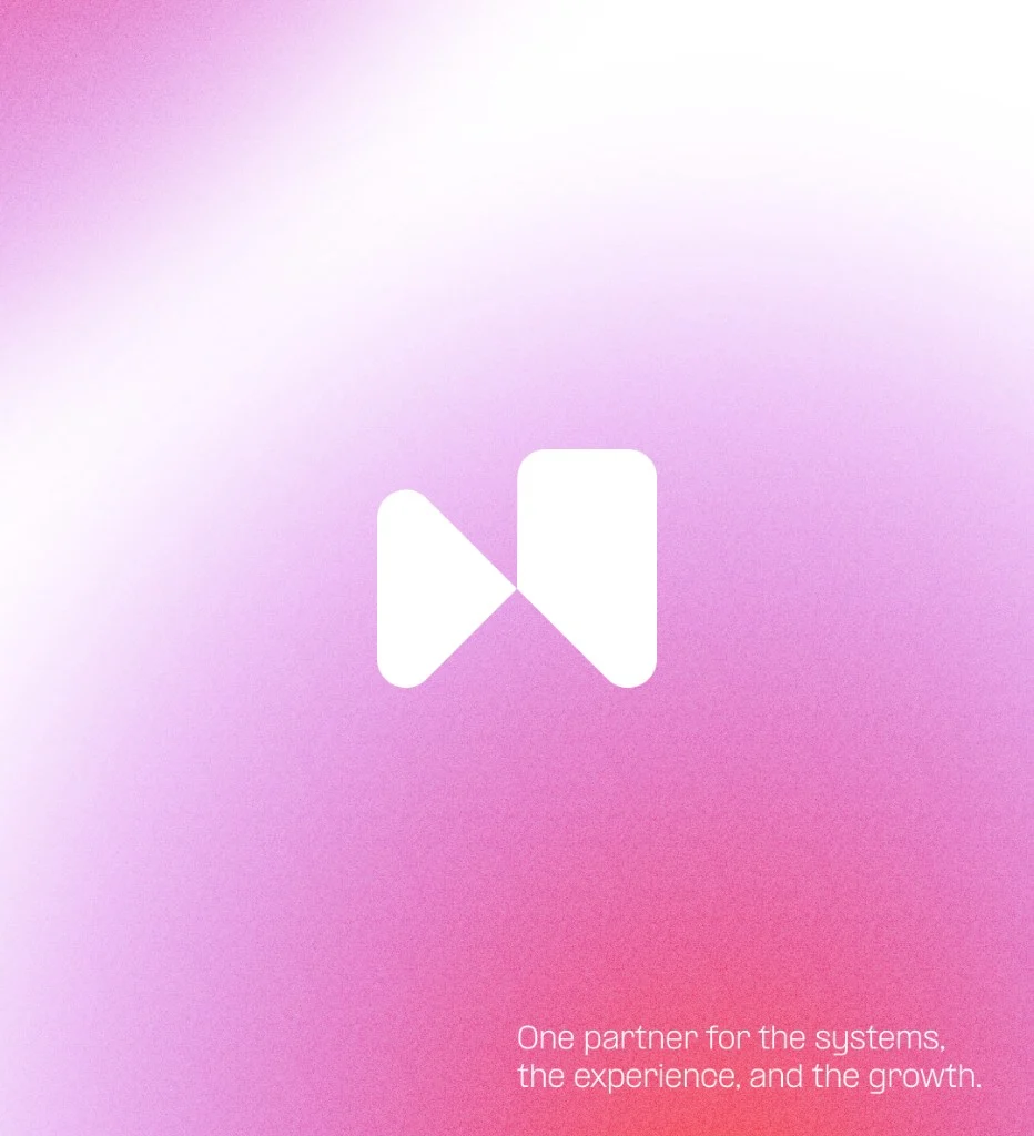
Neptune mark on a pink gradient, with the line one partner for the systems, the experience, and the growth
The project

A consistent brand that showed the work, and told one story.

The goal was a rebrand. Neptune needed an identity that felt more consistent, stood out, and did a better job of showing the work. The projects were already there. What was missing was one story, told the same way wherever a client met the studio.

Time was the constraint. A brand needed time spent on it if the decisions were going to hold. It also needed to happen quickly. Client work did not pause for a long identity programme, so the refresh had to be careful and fast at the same time.

The plan was a new logo, a colour scheme, and a design system. Those three things were there to standardise the brand across the website, proposals, social and every other platform Neptune used.

I used Figma to ideate, Illustrator where the vectors had to be accurate, and Photoshop for the photography. Claude and Cursor helped design and build the design system, so the rules could be made and applied in the same pass.
Research

Direction from the team, then a search for the mark.

The work started with the team. I needed a direction before drawing anything, so the mark and the colours had something to answer to. Those conversations set the brief: one brand, distinctive enough to stand out, and able to tell the story of the work.

From there I researched around those ideas. The question was how a logo mark could be made, and how a set of brand colours could belong to it. I looked at letterforms, at the N in Neptune, and at pairs of shapes that might lock into a single symbol. It had to be simple enough to repeat, and clear enough to be recognised without the word.

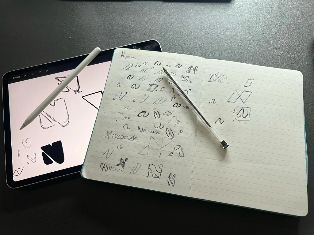
The first studies were drawn by hand, in a notebook and on the iPad. Lots of small marks, testing which forms held together. The symbol that went into the system came out of those pages.

The mark

One design from the sketches, drawn up in Illustrator.

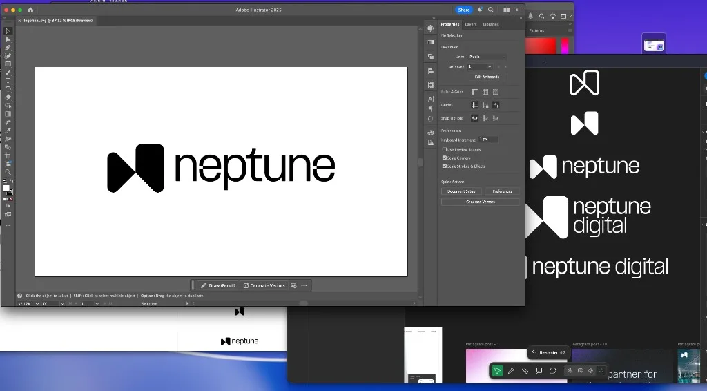
The notebook and iPad studies narrowed it down. One direction held: two shapes that read as an N, simple enough to repeat and clear without the word beside it. That was the design I landed on.

I took it into Illustrator to finalise the structure. Drawing it as vectors meant the proportions could be checked properly: the two forms, the space between them, and how Neptune sat next to the symbol. The lockups that followed were versions of that one drawing, so the structure stayed the same wherever the logo had to fit.

The design system, built up from the mark.

Each part was added so the next one did not have to invent its own rules. That is what kept the brand consistent once it left the file.

  1. 01

    Lockups for every place the mark had to fit

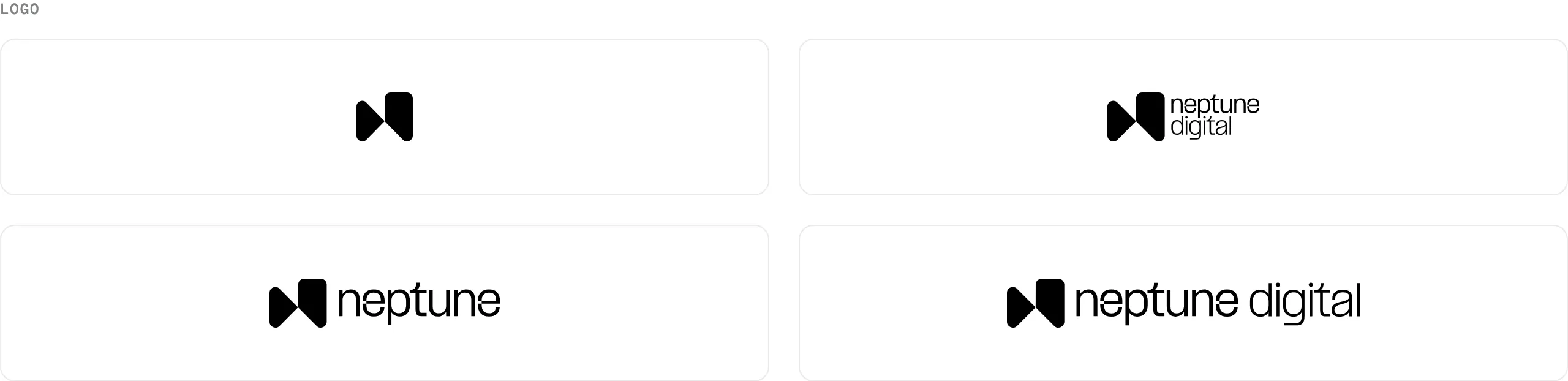
    The logo was a set of lockups, from the icon on its own to the full name. Which one to use was decided by the space: the icon for a square, the stacked mark when the width was tight, the full lockup when the name had to be read. The component locked the proportions, so the mark could not be squashed in a sidebar or a card. If the shape can drift, nothing built on it stays the same.

    Lockups for every place the mark had to fit
  2. 02

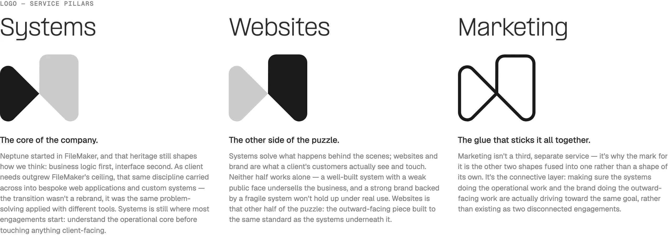
    One mark, split into the three things Neptune does

    Systems, Websites and Marketing were drawn from the same icon, not designed as three separate logos. Systems is the core of the company. Websites is the other half. Marketing is the outline that joins them. The offer stopped reading as a list of services and started reading as one shape.

    One mark, split into the three things Neptune does
  3. 03

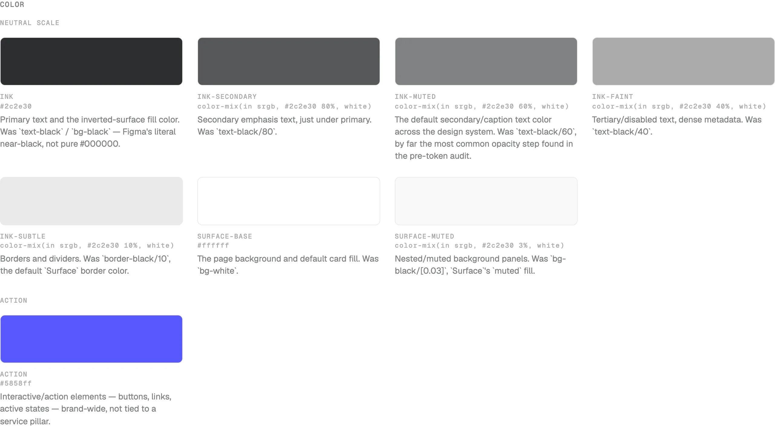
    A named colour scale, instead of a new black on every page

    Before this, text, borders and fills were one-off opacities of black. The system named the stops that were actually in use, from the near-black ink to the faint border, and added an accent for each pillar. A button, a caption and a divider then came from the same list. Nobody had to guess which grey was the caption.

    A named colour scale, instead of a new black on every page
  4. 04

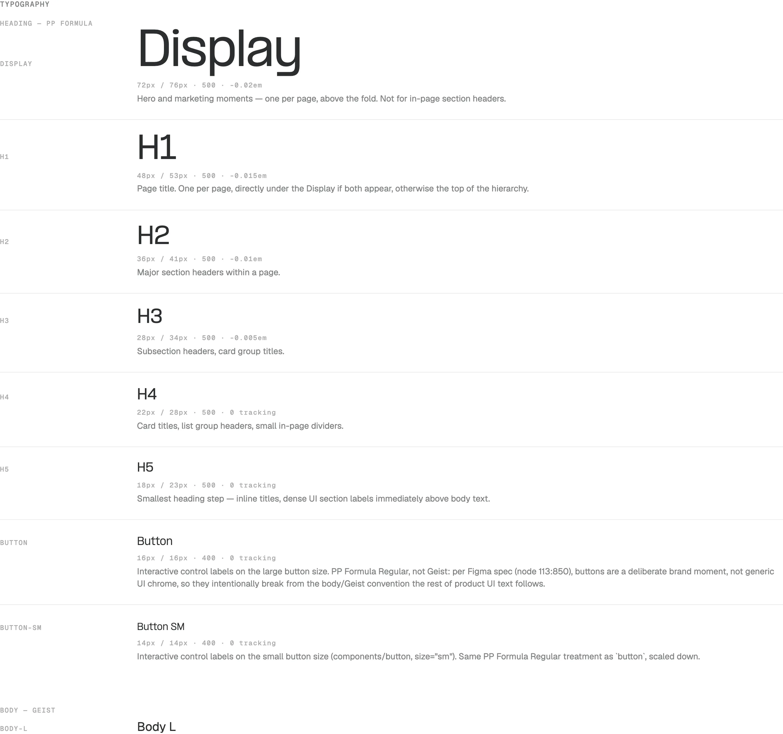
    Three type families, with a job each

    PP Formula carried the headings, Geist the body, and Geist Mono the labels. Buttons used the heading face on purpose, so a control still felt like the brand. Once the scale existed, a hero and a card title could not quietly become two different type systems.

    Three type families, with a job each
  5. 05

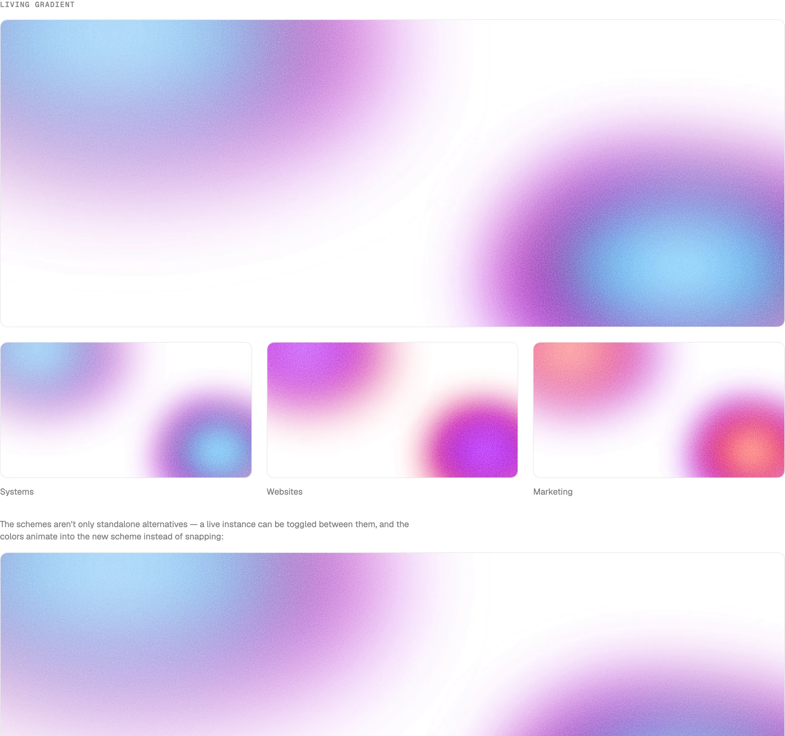
    One surface, recoloured for each pillar

    The living gradient was built once: two soft shapes and a grain. It then ran in the Systems, Websites and Marketing colours. Social, heroes and service cards all use that same surface. The colour changes. The treatment does not. That is what makes a post and a homepage feel like the same company.

    One surface, recoloured for each pillar
  6. 06

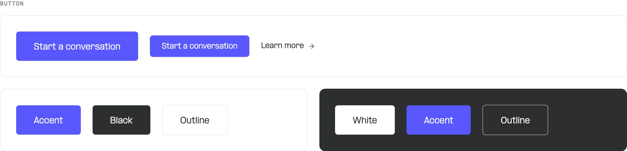
    Controls that could only be built from the system

    Large, small, and a text link. Filled, accent, outline, and a set for dark backgrounds. Radius, type and colour all came from the foundations, so a call to action on the site matched one in a deck without being redrawn.

    Controls that could only be built from the system
  7. 07

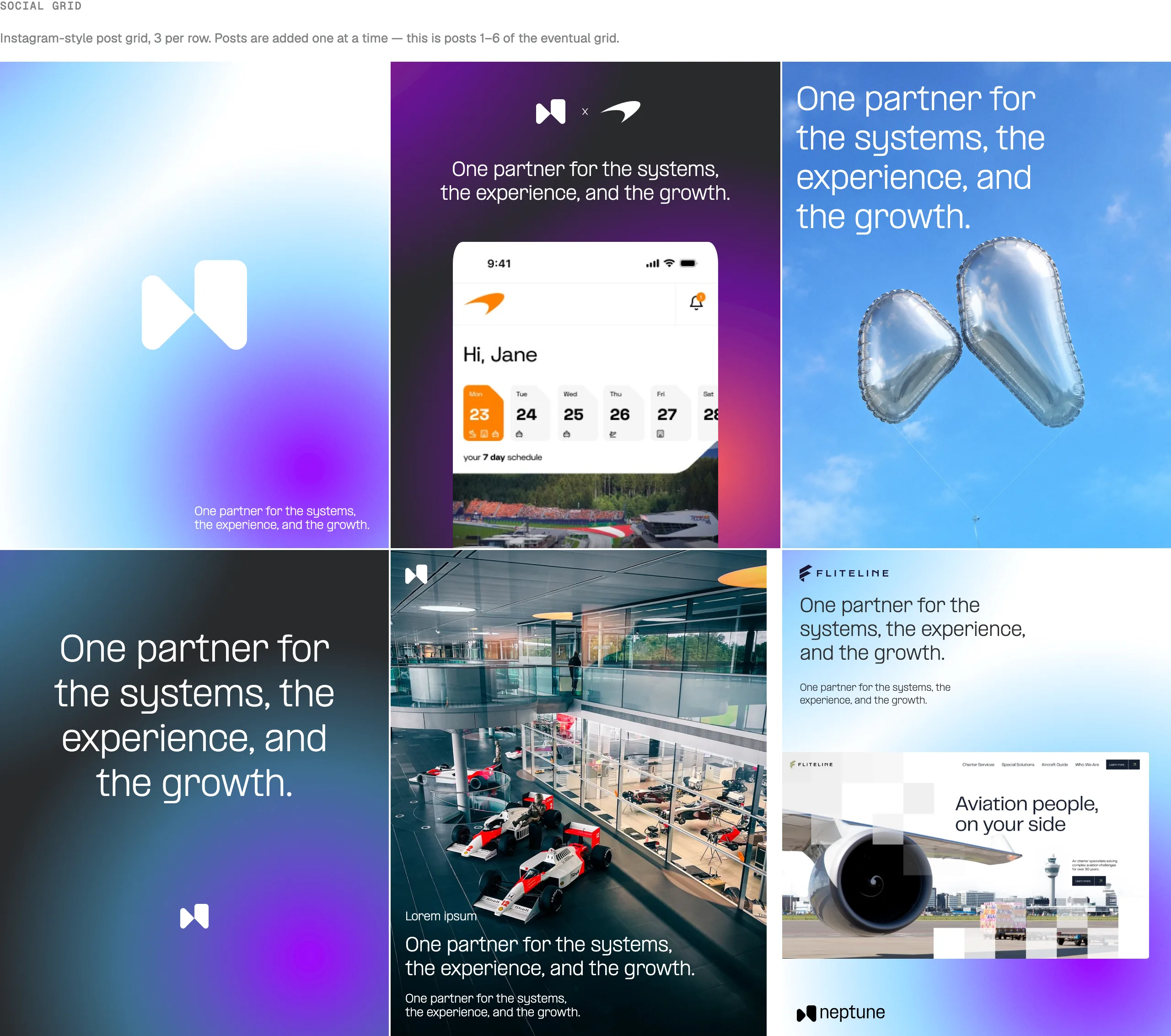
    The same ingredients, outside the website

    The social grid uses the mark, the gradient, the type and one line: one partner for the systems, the experience, and the growth. A post could not invent a new layout or a new colour and still sit in the grid. That was the consistency the rebrand was for. The work looks like Neptune wherever it is published.

    The same ingredients, outside the website
  8. 08

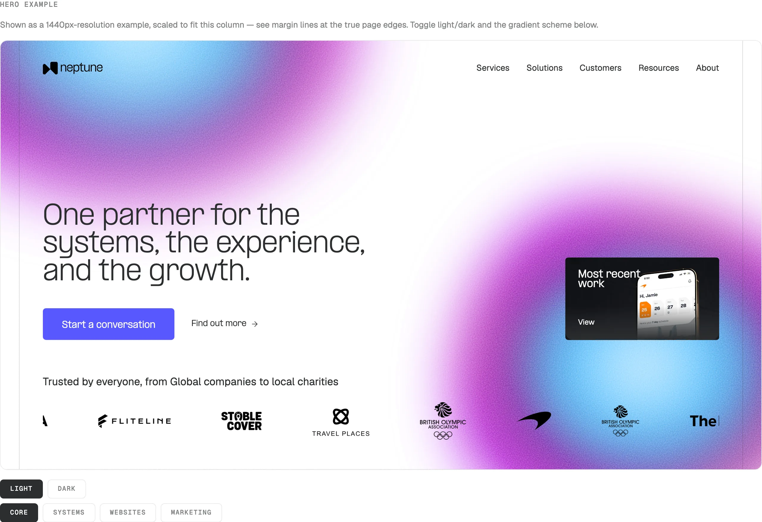
    The homepage, assembled from the pieces

    The hero is the lockup, the type scale, the button, the gradient and the client marks in one frame. Nothing in it is a one-off. Later sections, a split, a stat row, a case study card, use the same grid and the same tokens. The brand held because the page was built from the system, not placed on top of it.

    The homepage, assembled from the pieces
Direction

A product studio that was exceptional at Claris, not a Claris shop that also designed.

I treated this as a repositioning, not a restyle. The mark, the site and the templates could all change and still leave the same company standing there if the first sentence was still about being FileMaker developers. The first sentence had to change. The evidence underneath it did not.

So the platform moved down the page. It stayed in the work, in the path for people who had arrived looking for a Claris partner, and in the city and partner pages that already ranked. It stopped being the way the agency introduced itself to everyone else. What came forward was the thing clients actually bought: one in-house team that could design a system, build it, connect it and stay to run it.

The tone followed the projects. Neptune's best work was operational. It was used by people who noticed when something was vague. The brand had to be the same: short, specific, and willing to say what the team would not do. That was already how the studio behaved, taking on only a handful of new clients each quarter.

What the rebrand had to hold

Four things the new identity was not allowed to lose. They were why the agency won the work.

  1. 01

    The search

    FileMaker, Claris Partner, London, Manchester. Repositioning would have failed if the people with a live FileMaker problem could no longer find the team. Those pages stayed, and they got clearer. They did not get buried.

  2. 02

    The names

    The FA, McLaren, the Olympic and Paralympic associations, the ambulance service. That list was the argument. It belonged at the front of the site, not in a logo strip underneath a tool slogan.

  3. 03

    One team

    Design, build, integrate, host, support. That was already how a project ran. The brand had to read as one studio, not a menu of six services that looked like separate companies.

  4. 04

    A system the studio could run

    Proposals, case studies, decks and social were made every week by people who were not designers. The identity only held if they could produce it themselves. A guidelines PDF would not have survived a Tuesday deadline.

Where it had to show

The site was the first place the new generation had to be visible.

The website was where the repositioning was either obvious or it was not. It had to open on the work and the team, keep a direct path for someone who had arrived searching for a Claris partner, and use the same system in the proposal they received afterwards. Anything that only looked new on the homepage would have been contradicted by the next document the studio sent.

The identity, the site and the templates were built as one system, so the agency that showed up in a pitch was the same one that showed up in search.

Coming soon