Bascule project artwork
Client
Bascule Underwriting
Role
Creative Direction, Branding, Website Design
With
Neptune Digital

Bascule

Introduction / The Challenge

A specialist insurer built by people who know horses.

Bascule is a specialist equine insurer serving horse owners, breeders, boarding barns and training yards across 48 states. Its underwriters own and ride horses themselves, bringing first-hand knowledge to every policy and claim.

The challenge was making that difference visible in a category dominated by generic horse imagery, corporate blue and language written for underwriters. The identity and website needed to feel credible to agents, clear to owners and consistent across every day-to-day touchpoint.

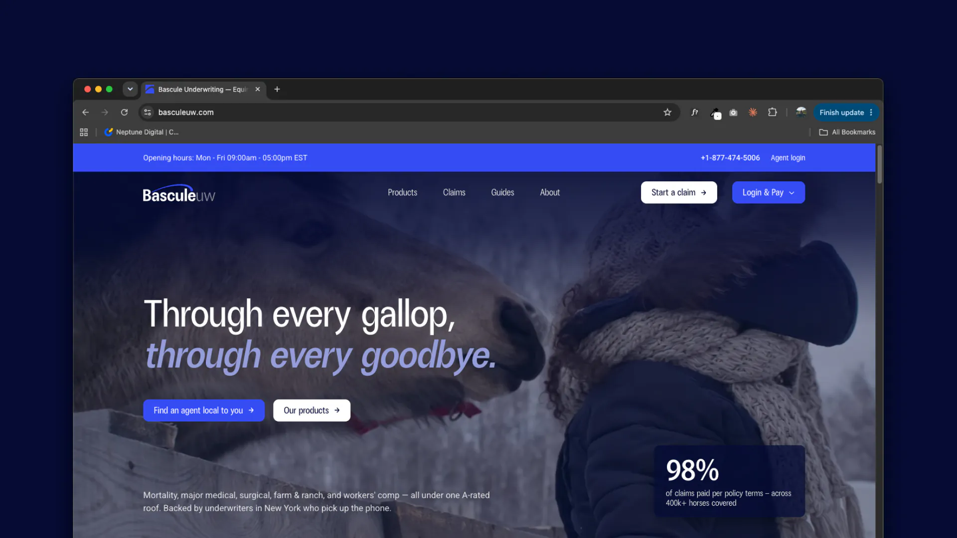
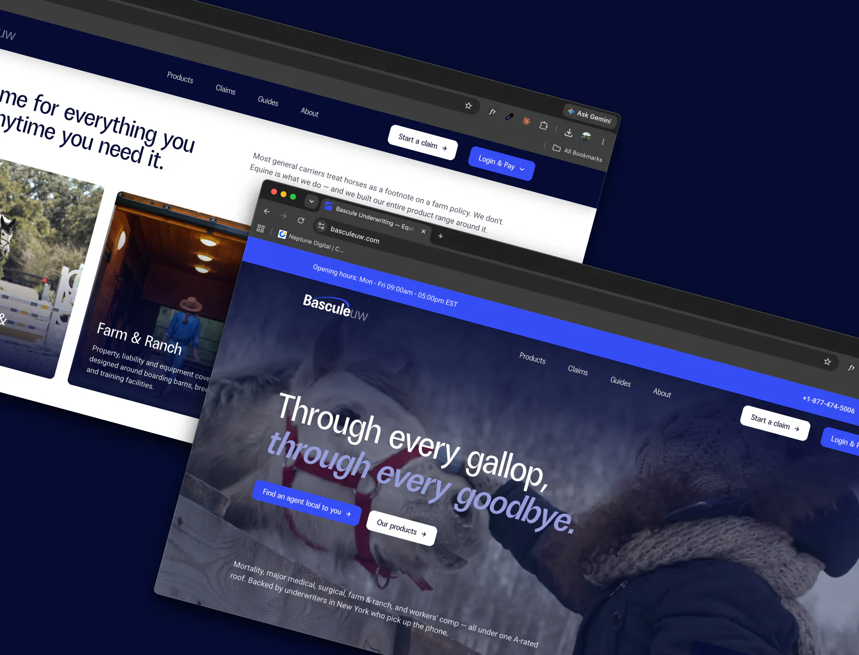
Bascule website shown across desktop and mobile devices

Brand Strategy & Identity

A bascule is the jump element a horse makes over a fence, the arc of the back at the top of the leap. It is a word only horse people use, which made it the right foundation for a brand whose whole claim is insider knowledge. The identity is built around that arc: a mark derived from the curve of the jump, used as a repeatable graphic device across the system rather than a logo that only ever sits in a corner.

Project main image
Project side image 1
Project side image 2

The Website

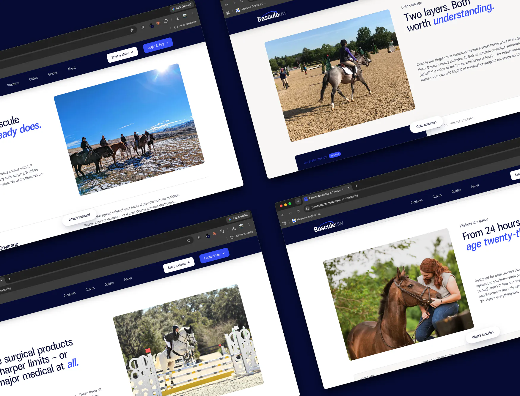
Bascule's product range is genuinely complex, so the site is organised around who visitors are and what they are protecting rather than a dense product matrix. Clear product details, exclusions and dedicated agent pathways sit underneath, while proof points appear where questions arise, creating a journey that owners, breeders and agents can navigate with confidence.

Photography throughout the site features the riders behind Bascule: the underwriters themselves. Putting the team at the centre of the story shows that it is the people who make Bascule what it is.

View Live site
Bascule website screens
Bascule website personality

A brand that spreads much further than online.

The brand does most of its work away from the website, in documents, decks and video calls. These were designed as part of the system rather than adapted from it afterwards.

Every template and design was handcrafted around its purpose, giving the Bascule team practical, consistent tools for proposals, presentations, print and everyday client communication.

Proposal documents, policy summaries and agent-facing material built on a shared grid and type scale.
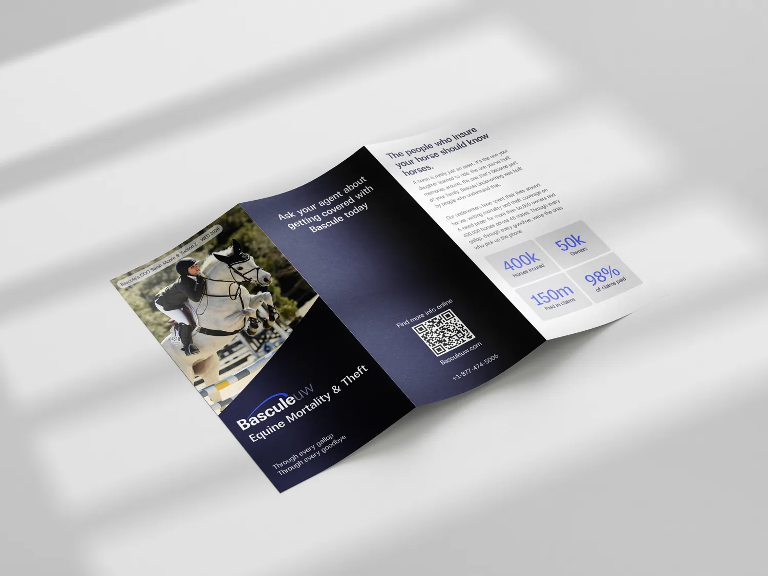
A trifold brochure for product awareness, built on the same grid and type scale as the digital collateral.
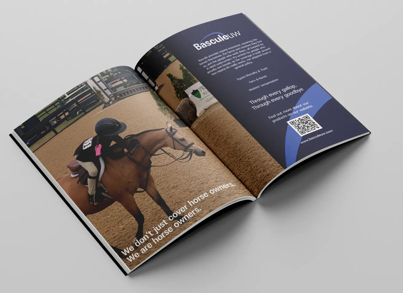
An advert spread for Plaid Horse magazine, extending the identity into print media.
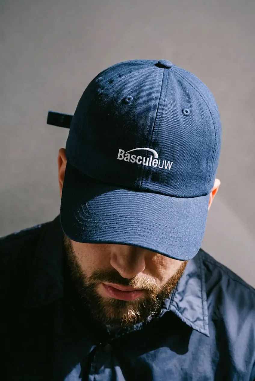
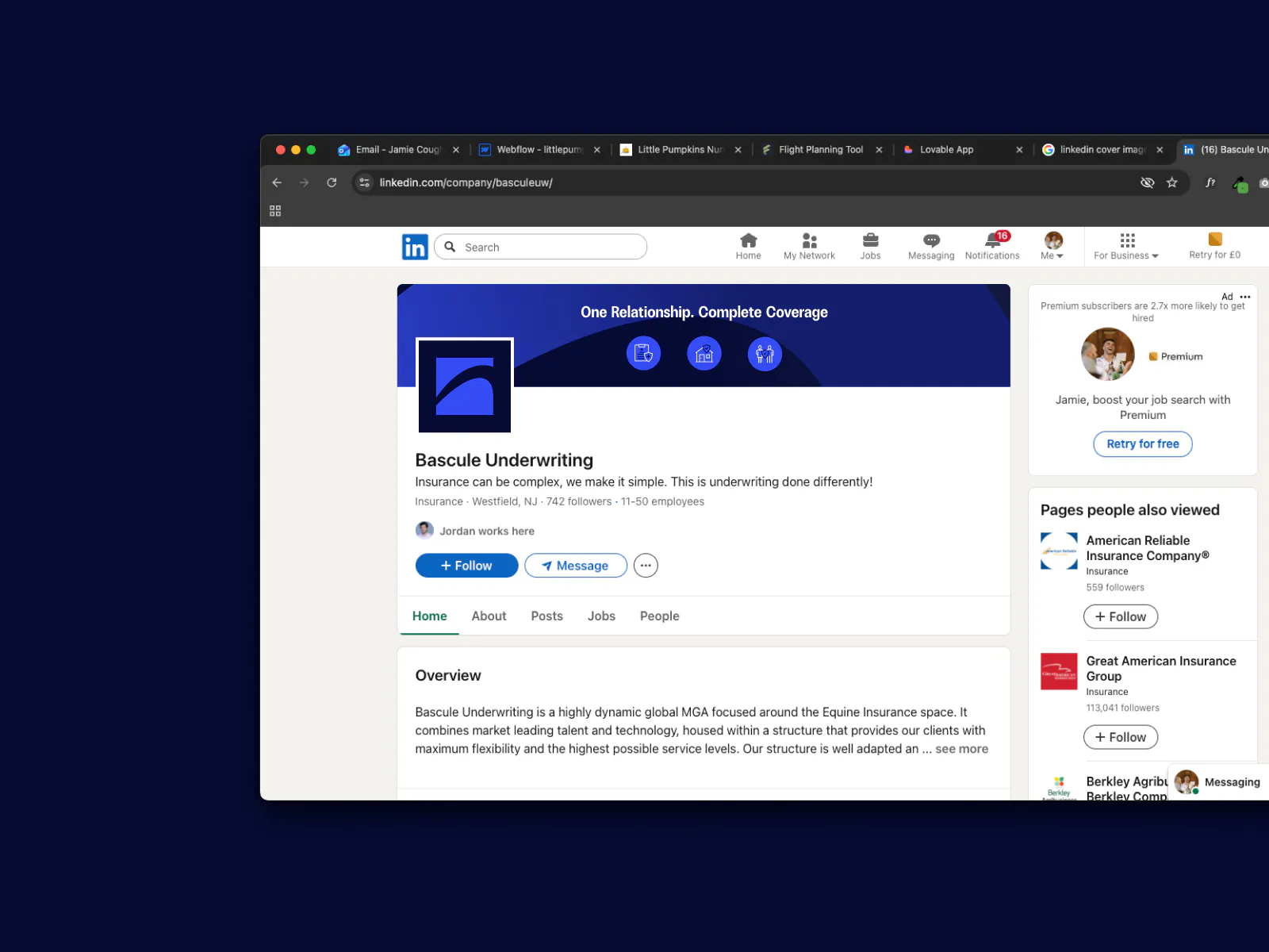
Teams backgrounds, presentation templates and email signatures: the touchpoints a remote sales team uses every day.

A Design System In Claude

Rather than hand over a PDF of guidelines, I built the brand into Claude as a working design system, so the team can generate on-brand documents themselves without opening a design tool.

  1. 01

    The brand as instructions, not a document

    The identity is encoded as a set of skills Claude loads on demand: the type scale, palette, spacing rules, logo usage, tone of voice and document architecture written as instructions an agent can act on. A PDF describes what correct looks like. This produces it.

  2. 02

    Templates that generate, not fill in

    Proposals, policy summaries, one-pagers and agent packs are defined as structures with real typographic rules behind them. The team describes what they need in plain language and gets a finished, on-brand document, not a blank template to fight with.

  3. 03

    Tone of voice enforced, not just documented

    The voice rules travel with the visual ones: plain language, no carrier jargon, explicit about exclusions, human about the difficult parts, applied consistently whether the output is a landing page, an agent email or a claims explainer.

  4. 04

    Guardrails on the things that break brands

    The constraints are the point, covering approved colour values, permitted type pairings, minimum logo clear space, and no stock sunset photography. The system makes the on-brand route the fastest one, which is the only way adherence actually survives a busy week.

  5. 05

    Built for the people doing the work

    Underwriters and account staff are not designers and should not need to be. Producing something correct takes a sentence, so brand consistency stops depending on whether anyone had time to do it properly.

  6. 06

    A system that can be extended

    New document types can be added as new skills as the business grows, so the system compounds rather than dating. The brand stays live and usable instead of decaying into a guidelines file nobody opens.

The Outcome

Bascule now has an identity that says something true about the business rather than something generic about the category. The arc of the jump gives them a mark that horse people recognise on sight, and the positioning gives every piece of communication a consistent claim to make: expertise held by people who live the same way their customers do.

The website turns a genuinely complicated product range into something an owner, a breeder or an agent can navigate on their own terms, with the proof points placed where buying decisions actually stall. The collateral extends the same system into the documents, decks and video calls where most of the relationship is really conducted.

The part that changes how the brand behaves over time is the Claude design system. Brand consistency usually degrades the moment a team is busy, because the correct route is the slow one. Here it is the fast one. The team produces on-brand material themselves, at the speed the business actually moves, and the identity holds without a designer in the loop for every request.