McLaren

DATE

2025—2026

CLIENT

McLaren Formula 1 Team

OVERVIEW

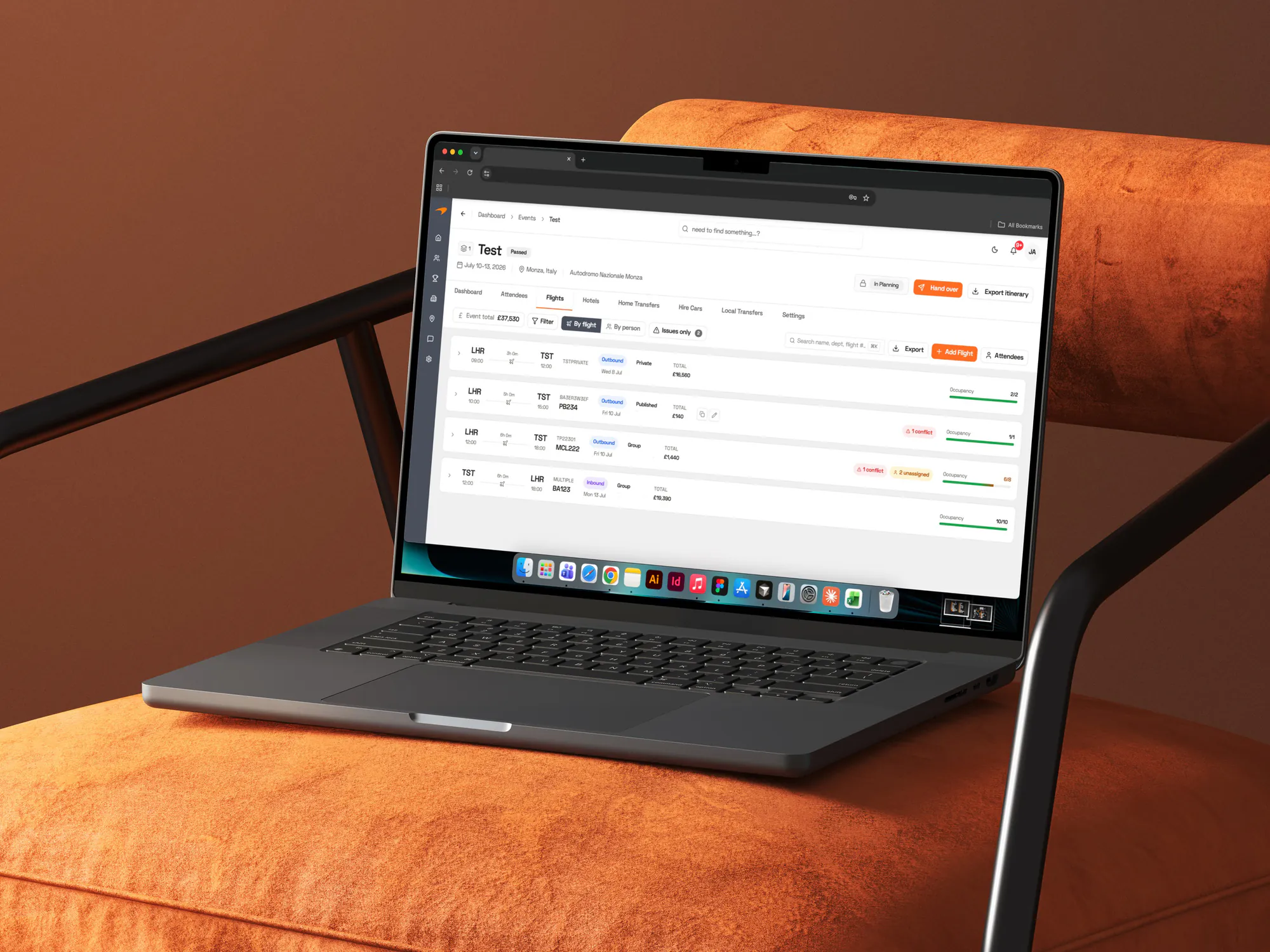
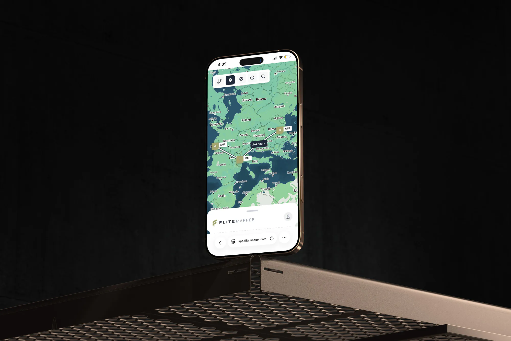
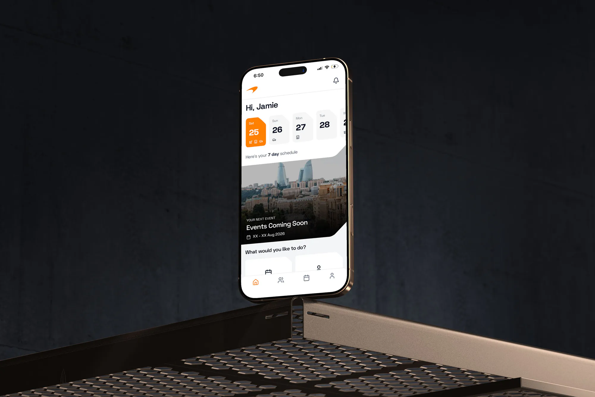
A travel operations platform for the McLaren Formula 1 team, replacing a fragmented mix of spreadsheets, a third-party itinerary app, email and WhatsApp. A desktop application gives the travel team a single source of truth for flights, hotels, car hire and ground transport across a full season, alongside a directory of 300+ travellers with document expiry tracking. A companion Progressive Web App gives travellers and team leaders their own itineraries, documents and profiles.

MY ROLES

  • Discovery Workshops
  • UX Design
  • Prototyping
  • UI Design
  • Build
  • Documentation
Full width project image

The Problem

A small travel team moves a squad of 300+ people to 24+ races a season. Every event needs flights, hotels, car hire and ground transport arranged for each person — each with their own role, arrival window, visa requirement and passport expiry. There is no margin for error: miss one detail and someone doesn't make it to the grid.

The work was spread across five disconnected tools. Excel tracked allocations, a third-party platform distributed itineraries, email handled suppliers, WhatsApp carried internal coordination, and Smartsheet covered specific workflows. Nothing was a single source of truth, so answering a question as basic as "who doesn't have confirmed accommodation?" meant cross-referencing tabs by hand.

Distributing an itinerary was its own loop: export the finished spreadsheet, upload it, correct the import errors, then notify travellers — and repeat the whole cycle for every change. That delay between confirming travel and travellers seeing it was where the real risk sat. The team wasn't short on process; the tooling simply made every event a manual rebuild, leaving no time for anything but firefighting.

What Success Looks Like

The workshops set the bar for what the platform had to achieve to be worth switching to. Success was defined in the travel team's terms, not in features.

  1. 01

    Legacy tools switched off

    Not "used alongside". If the team still needed spreadsheets or the old itinerary app for any part of the job, the platform had failed — parallel processes would mean more work, not less.

  2. 02

    Instant answers to standing questions

    "Who has no confirmed hotel?", "which commitment dates are close?", "what has this event cost?" — answerable at a glance rather than by manual review.

  3. 03

    No missed supplier deadlines

    Commitment dates carry real financial penalties when they slip. The system has to surface them early enough to act, without anyone remembering to check.

  4. 04

    Travellers see changes immediately

    A confirmed change reaches the traveller's app straight away, with no export, upload or correction step in between.

  5. 05

    Documents never expire unnoticed

    Passports, visas and driving licences are tracked against upcoming travel and flagged well ahead, so nothing is discovered at check-in.

  6. 06

    Finance keeps its workflow

    Finance depends on comparing versions to reconcile budgets. If the platform broke that, it would create a new problem while solving an old one.

Design Goals

These principles settled the day-to-day trade-offs and kept a very feature-dense product coherent as it grew across ten phases.

  1. 01

    Serve the intent, not the artefact

    Familiar patterns were kept where they carried real meaning — spreadsheet-style tables and colour-coded changes stayed. But where a workaround existed only because the tool couldn't do better, I designed for the underlying need instead of replicating the workaround. Version tabs were the clearest case.

  2. 02

    Density with hierarchy

    A professional tool used all day by expert operators. I designed for information density rather than hiding data behind progressive disclosure, then used typography and spacing to keep dense views scannable.

  3. 03

    Two products, one system

    The desktop platform and the traveller PWA serve very different users but share a design language, components and data model — so the team recognises what travellers see, and neither product drifts.

  4. 04

    Surface risk, don't bury it

    Expiring documents, unbooked legs, approaching commitment dates and unallocated travellers are promoted into the interface rather than waiting to be searched for. The system does the noticing.

  5. 05

    Context lives with the record

    Decisions were being lost across WhatsApp and email. Comments, mentions and attachments belong on the individual seat, room, car or transfer they concern — so the reasoning is still there months later.

  6. 06

    Control what travellers see

    Coordinators work with incomplete data for weeks. Draft and published states, controllable per allocation type, let the team work openly without ever showing travellers something unconfirmed.

Prototypes

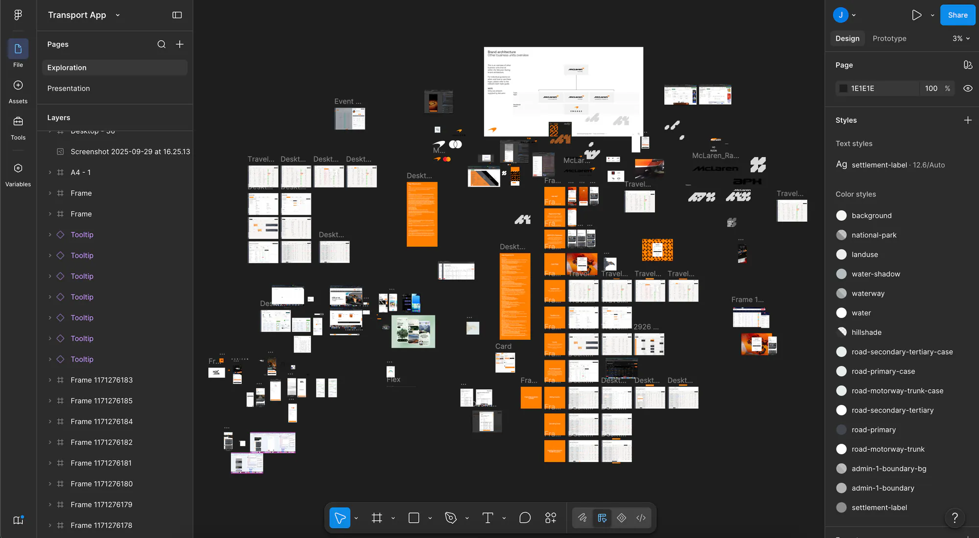
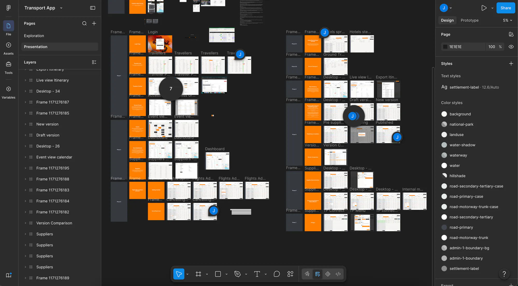
Figma prototypes used to pressure-test the flows with the travel team before committing to a build.

The exploration canvas — early wireframes, mobile concepts and brand architecture explored in parallel.
The presentation file, organised into delivery phases — travellers, events, flights, versioning and suppliers.

UX Exploration

The hard problem was structural rather than visual: one data model had to serve season-long event logistics, per-person records, supplier versioning and two very different audiences.

  1. 01

    Discovery workshops

    I started with the travel team, mapping how an event actually comes together from squad selection to post-event reconciliation. Sitting with the people doing the work surfaced the constraints that don't appear in a requirements list — which spreadsheet quirks were load-bearing, where the real time went, and which "inefficiencies" were deliberate.

  2. 02

    Auditing the spreadsheets

    Their live sheets were the most honest specification available. Mapping them exposed the true data model, including rules encoded in colour fills and comment threads — and separated the conventions worth keeping from the ones that were only ever workarounds for what a spreadsheet couldn't do.

  3. 03

    Modelling people, events and allocations

    The central insight was separating the person from the trip. A traveller has durable attributes — passport, visa, dietary needs, seating preference, role — while an event holds allocations that reference them. This split let documents be tracked once and validated against every future trip instead of re-entered per event, and made expiry tracking possible at all.

  4. 04

    Rethinking versioning as comparison

    The team tracked changes by duplicating spreadsheet tabs — V1, V2, V3 — and hand-colouring what differed. Interrogating why revealed the actual need wasn't versions at all: it was seeing what changed since the last thing sent to a supplier, and confirming those changes once agreed. Duplicating tabs was just the only way a spreadsheet could approximate that. So instead of replicating version tabs, I designed comparison between exports directly, with changes carried across once confirmed. Same intent, far less manual bookkeeping — and no parallel copies to drift out of sync.

  5. 05

    Designing finance tracking properly

    Finance was reconciling invoices by extracting figures from spreadsheet versions after the fact — retrospective, manual and detached from the bookings themselves. Because the allocation data already existed in the system, cost could be a property of each booking rather than a report assembled later. I designed cost tracking into the allocations themselves, so budget position, variance and reconciliation come out of the same records the travel team maintains, with commitment dates surfacing the financial deadlines that carry penalties when missed.

  6. 06

    Prototyping in Figma

    Before committing to a build, I prototyped the core flows in Figma to pressure-test my understanding with the team. Putting something concrete in front of them changed the conversation: reactions to a real seat-allocation screen surfaced requirements that abstract discussion never would, and it was far cheaper to be wrong at this stage.

  7. 07

    Designing for real volume

    I tested flows against realistic full-squad datasets rather than tidy samples. Several layouts that felt comfortable with ten rows collapsed at full scale, which drove the sticky headers, persistent filtering and bulk-selection patterns in the final design. Every flow assumes multi-select as the primary path.

  8. 08

    Designing the traveller's minimum

    Travellers needed the opposite of density: the next thing that matters, immediately. I explored dashboard layouts before settling on a chronological timeline — the answer to "where do I need to be next?" with no navigation. Offline access mattered more than any feature, since it's used abroad on poor connections.

  9. 09

    Resolving the team-leader overlap

    Team leaders are both travellers and supervisors, and some oversight relationships ignore the org chart entirely — a driver's PA, manager and trainers need access across departments. Rather than a third product, I designed scoped views reusing traveller components at team level, with access groups handling the exceptions.

  10. 10

    Onboarding without migration

    Migrating years of inconsistent traveller data would have been slow and would have carried its errors into the new system. I designed a form travellers complete themselves instead, with conditional logic for special requirements. Data quality improved because the person who knows the answer provides it.

From Prototype To Product

Beyond design, I built much of the system myself, working in continuous contact with the McLaren travel team throughout. That loop is what made the product usable rather than merely complete: features went in front of the people who would live with them daily, and their reactions changed the design while changing it was still cheap.

Being both designer and builder removed the usual translation layer. When a flow didn't survive contact with real data, I could change the design and the implementation together rather than negotiating a handover — which mattered enormously in a product this dense, delivered across this many phases.

I also wrote the how-to guides that support training and onboarding. A platform that replaces five tools at once only succeeds if people can actually adopt it, so documenting the system was part of delivering it, not an afterthought.

Delivered Features

The platform covers the full operational picture: traveller profiles with document expiry tracking, season and event configuration across single races, back-to-backs and triple headers, and allocation management for flights, hotels, car hire and transfers — including multi-leg journeys, roommate pairing, named drivers and capacity tracking.

On top of that sits supplier-facing versioning with colour-coded change tracking, draft and published states, automatically generated itineraries and full PDF itinerary exports, multi-channel traveller notifications, calendar integration, and allocation-level collaboration with comments, mentions and attachments.

The export layer reproduces the team's original spreadsheet formats precisely. Because they came onto the platform from sheets, exporting back into the exact shape they already knew removed the biggest barrier to adoption — the platform earned trust rather than demanding it.